Global coatings firm The Sherwin-Williams Company recently released its 2023 Colormix Forecast. The collection, dubbed TERRA, features 40 hues in four palettes that aim to embrace “regeneration, creativity, care, connection and joy.”
“We are on an intentional journey to experience beautiful, living color as we evolve,” said Sue Wadden, Director of Color Marketing at Sherwin-Williams. “Our connection to the Earth, fondest memories and future hopes are what will influence our global outlook in the months to come.
“These influences affect our commercial spaces as much as they do our homes. Embracing the idea of TERRA in design inspires a new way of living that will be defined by balance, presence, support and the enduring joy that awaits us.”
According to Sherwin, Wadden and the company’s Global Forecast Team of color professionals conduct extensive research each year individually, then come together in a workshop to build the forecast and set the tone for the conversation and what the color of the year will be.
For this research, the team considers various trend topics, such as climate change, mental health and more, which are then translated into defining colors and cohesive palettes.
The TERRA palettes (balanced Biome, passionate Lore, serene Nexus and vibrant Origin) feature rich earth tones, natural clays, sunbaked sands, restful neutrals and powdery pastels. The palettes include:
Biome – a collection that draws on the components of an ever-changing ecosystem, this palette looks to celebrate the similarities between “an abundant Earth and a quest for balance” with such as Antler Velvet and Shiitake;
Lore – a palette with the goal of creating inspiration from various cultures and centuries, the hues, such as Studio Mauve and Blue Peacock, invite users to reconnect with bold expressions;
Nexus – a group of grounding tones influenced by daily well-being rituals, colors such as Reddened Earth and Likeable Sand aim to “highlight serenity and restoration”; and
Origin – the last grouping in the bunch that tries to embrace “hybrid living to the notion of metamorphosis” with hues such as Fabulous Grape and Goldfinch.
The full palettes can be found here.
Commercial Colormix Forecast 2023
At the same time the 2023 Colormix Forecast was released, Sherwin-Williams noted that this year’s commercial forecast contains six distinctive commercial palettes using the 40 forward-looking colors of TERRA.
The colors are meant to be explored and embraced when designing inspiring spaces for commercial, hospitality, new residential, healthcare, education and multifamily settings.
According to Sherwin, each palette captures themes of resourceful ingenuity, pushing boundaries, embracing community and diving into a new way of living, reflecting how these ideas will continue to influence the commercial design landscape in 2023 and beyond.
The following palettes were outlined in an emailed press release:
Commercial – Designed to evoke a casual and earthy vibe;
Hospitality – Inspired by hyper-localization and mindful luxury with deeply saturated colors;
Education – Uses spirited colors and natural wooden materials to create holistic surroundings;
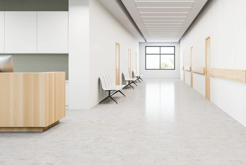
Healthcare – Encourages enhanced patient and caregiver experience through a bio-immersive palette; and
Multifamily and Residential – Aims to create a sense of home while promoting relaxation, focus and comfort.

Valspar, HGTV Home Release 2023 Color Collections
In August, paints and coatings brands Valspar and HGTV Home, both from The Sherwin-Williams Company’s Consumer Brands Group, announced their 2023 Colors of the Year.
Valspar says its 12 trendy-worthy, forward-thinking hues are composed of what’s to be a lasting change of comfort and acceptance.
According to reports, when forecasting the 2023 Colors of the Year, Valspar color experts thoughtfully matched each color to a specific facet or emotion of life, all relating to what people may find helpful to complement their space.
“Valspar’s 2023 Colors of the Year are usable shades that encourage self-expression and anyone can envision in their space,” said Sue Kim, Valspar Color Marketing Manager. “With our 12 colors to choose from, you are guaranteed to find a color that is picture-perfect for you!”
Valspar adds that this year’s curated collection turns to nature-inspired design, and aims to evoke joy and inspire the growing DIY movement.
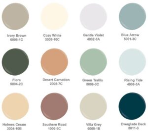
The 12 colors include:
Cozy White – a light white, with yellow undertones;
Villa Grey – a cool grey;
Rising Tide – a soft blue;
Gentle Violet – a white hue softened by violet undertones;
Holmes Cream – a classic tan;
Ivory Brown – a washed brown;
Blue Aaron – a cool blue with a slight yellow undertone;
Green Trellis – a hazy green;
Desert Carnation – a faded, natural terracotta;
Southern Road – a muted clay with brow undertones;
Flora – a deep, blackened olive hue; and
Everglade Deck – a midnight blue.
Explore all the trending shades and how to style them here.
A few days after Valspar’s announcement, HGTV Home by Sherwin-Williams also unveiled its 2023 Color Collection of the Year in addition to its 2023 Color of the Year
The colors were selected by Sherwin-Williams in partnership with design experts from HGTV.
This year’s color collection, The Vintage Homestead Color Collection, is composed of 10 shades aimed to evoke feelings of balance, hope and comfort. According to HGTV, the colors were influenced by heritage and romance, crafting a look that is familiar in an individualistic way.
“The Vintage Homestead Color Collection offers an effortless look that reveals the importance of being hopeful to find stability and balance,” said Ashley Banbury, HGTV Home by Sherwin-Williams Senior Color Designer.
“Our 2023 Color Collection of the Year revives elements from the past that are perfectly paired with vintage, comfortable and classic colors.”
The 10 colors include:
Poetry Plum (HGSW6019);
Restrained Gold (HGSW6129);
Natural Linen (HGSW9109);
Darkroom (HGSW7083);
Cool Beige (HGSW9086);
Austere Gray (HGSW6184);
Pewter Green (HGSW6208);
Glamour (HGSW6031);
Wall Street (HGSW7665); and
Hot Cocoa (HGSW6047).
All the colors are reportedly distinguished by HGTV Home’s Color of the Year: Darkroom (HGSW7083). The COTY is reported to be a black hue that creates dimension with a purple undertone, inspired by the need to craft a comfortable home that is both elegant and romantic.
The shade is designed for heritage interiors, but would also be favorable in modernly retro or throwback-inspired settings inside or outside.


